
Themes
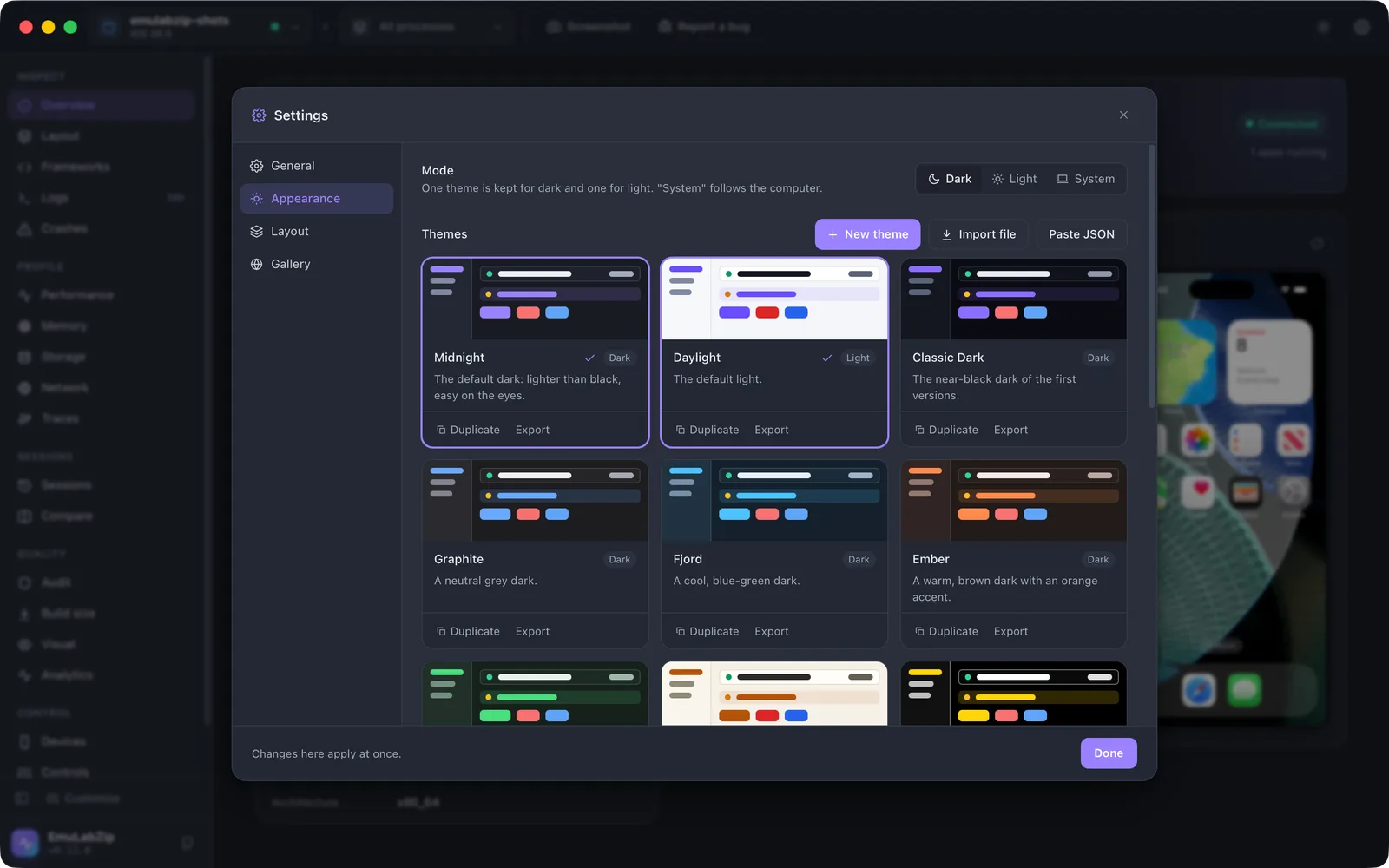
EmuLabZip ships with ten themes, and you can make your own, import someone else's, and share yours in the community gallery. Open Settings (⌘,) and go to Appearance.
Using a theme#
The app keeps one theme for dark and one for light. Choosing a theme sets the one for its base, and the Mode switch (dark, light or system) picks which is shown. The sun and moon button in the toolbar flips between the two.
The built-in themes:
| Theme | Base | |
|---|---|---|
| Midnight | dark | The default: a lighter dark that is easier to read. |
| Classic Dark | dark | The near-black theme of earlier versions. |
| Graphite, Fjord, Ember, Forest | dark | Neutral grey, cool blue, warm and green. |
| Daylight | light | The default light theme. |
| Paper | light | A softer, warmer light. |
| High Contrast Dark and Light | dark, light | AAA contrast for text. |
Making a theme#
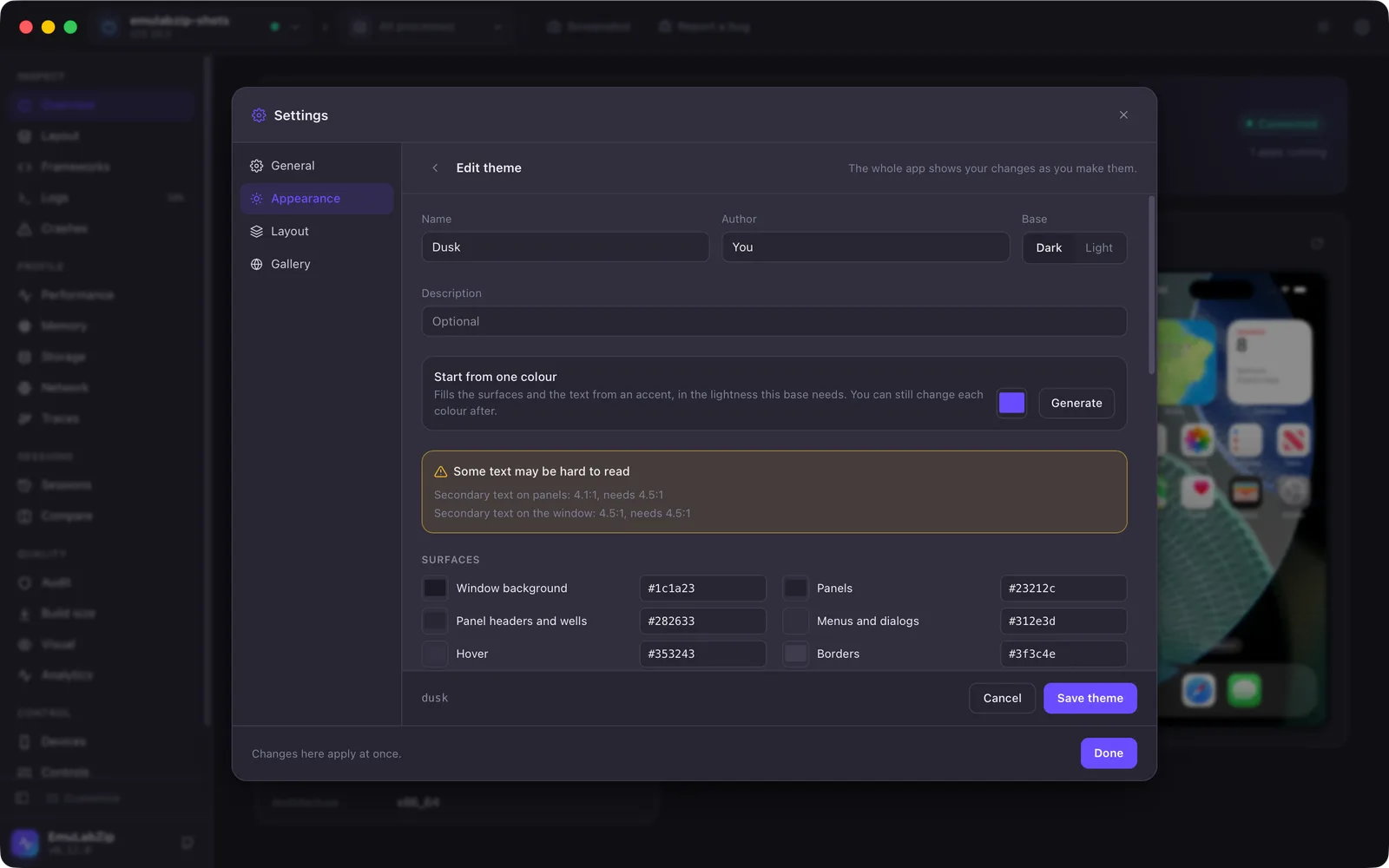
New theme opens the editor, and Duplicate on any card starts from that theme. The whole app shows your changes while you edit; Cancel puts the chosen theme back.
- Start from one colour fills the surfaces and the text from an accent, in the lightness the base needs.
- Every colour has a picker and a text field. Colours are
#rgb,#rrggbb,#rrggbbaa,rgb()orhsl(). - Fonts are family names, separated by commas. They must be installed on the computer; nothing is downloaded.
- Roundness goes from square (0) to very round (2).
- The editor warns when text would be hard to read: it checks the WCAG contrast of the main pairs (text on the window and on panels, secondary text, hints, accent, errors, warnings).
Under the cards, Fine-tune changes things that are yours and not part of any theme: text size (85% to 140%), interface scale, density, roundness and fonts. Reset the fine-tuning puts them back.
The file format#
A theme is one JSON file of a few hundred bytes of colours, and at most 64 KB:
{
  "schema": 1,
  "id": "aurora",
  "name": "Aurora",
  "author": "EmuLabZip",
  "description": "Violet accents on a deep, cool grey.",
  "base": "dark",
  "colors": { "bg": "#1d1a23", "panel": "#24212c", "fg": "#f1eff7", "accent": "#8b5cf6" },
  "fonts": { "sans": "Inter, system-ui, sans-serif", "mono": "Menlo, monospace" },
  "shape": { "radius": 1 }
}
The colour names are the groups of the editor: surfaces (bg, panel, panel-2, elevated, hover, line,
line-strong), text (fg, muted, faint), accent (accent, accent-2, accent-soft, select), status (ok, warn,
err, info), charts (series-1, series-2, flame-app, flame-framework, flame-native, flame-kernel) and log
levels (lv-verbose, lv-debug, lv-info, lv-warn, lv-error, lv-fatal). A colour you leave out is taken from the
default theme of the base.
Why a theme is safe to open#
A theme can come from anyone, so it is checked before it is used:
- a colour must be a hex colour or
rgb()/hsl()with numbers, and nothing else; - a font is a list of family names.
url(, braces and semicolons are refused, so a theme cannot carry CSS or load a file; - unknown keys are dropped, and the file cannot be bigger than 64 KB;
- the app's content security policy does not allow anything remote except the gallery's own address.
Import and export#
Export on a card saves a theme as <id>.json. Import file reads one, and Paste JSON takes the text. The theme
is shown on a card first, and installed only when you press Install.
The community gallery#
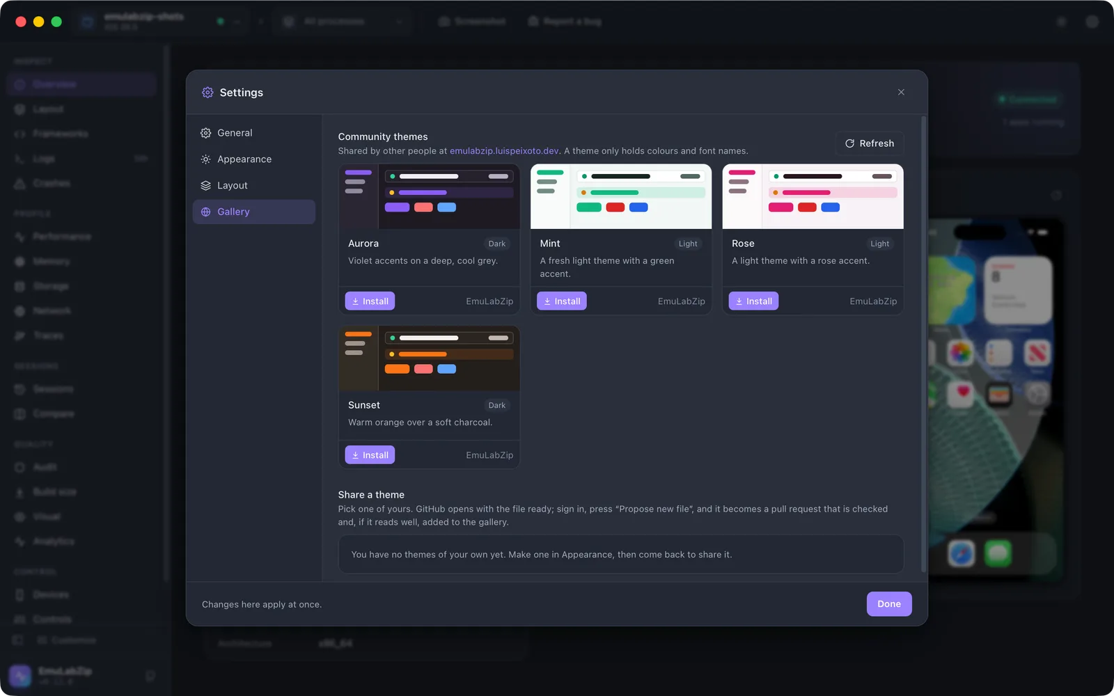
The Gallery tab lists themes shared by other people, read from
https://emulabzip.luispeixoto.dev/themes/index.json. Install one and it is yours to use and edit. Offline, the tab says
so and everything else keeps working.
Share your theme#
- Give the theme an author and a description in the editor.
- In Gallery, pick the theme under Share a theme and press Open on GitHub.
- GitHub opens a new file,
site/static/themes/<id>.json, with your theme in it. Sign in and press Propose new file; it becomes a pull request.
You can also add the file by hand to site/static/themes/ in a pull request. The site build checks every file with the
same rules as the app (node site/build.mjs --check), and a pull request that fails the check cannot be merged:
- the file is named after its
id, which must be lower-case letters, digits and hyphens, and not one of a built-in theme; - it has an
authorand adescription; - every colour and font passes the checks above;
- text is readable: at least 4.5:1 for text and secondary text on the window and on panels.
The index the app reads is made by the build from these files, so there is nothing else to edit.